FINCHAIR
Role(s): UX/ UI Design
Duration: 2 Weeks
1/4 DISCOVER
Brief
“A credit motivation app which rewards its users for learning healthy financial habits.”
The app has to be efficient enough to compel the consumer to change their habits. In order to do that, it is necessary that we understand what users want as rewards. What is it that can incite the users to keep using our app?
Managing finances and EMI’s through different banks can be difficult to stay on top of and can often lead to missing payments, deadlines and rewards. This lack of organisation can affect a person's credit score and worsen their financial situation.
Discussion Guide
To prepare for the initial stakeholder meeting, we as a group brainstormed key areas and topics from the brief that we felt was important to get clarification on in order to start our research process. eg:
What is your business model?
The client’s business model revolves around a network of brands and retailers with affiliation and commission at the core.
How fun would you like your product to be?
The client had a big emphasis on the app being very fun and gamified. They expressed that they didn’t want Finchair to just be another financial technology app but rather categorised as a lifestyle app.
“Cannot feel like a fintech app. Must feel like success!”

Following the stakeholder meeting we created a brainstorm to help visualise some key words from what we learnt about Finchair.
Word Tree
Competitor Analysis
TBC TBC TBC TBC TBC TBCTBC TBC TBCTBC TBC TBCTBC TBC TBCTBC TBC TBCTBC TBC TBCTBC TBC TBCTBC TBC TBCTBC TBC TBCTBC TBC TBCTBC TBC TBCTBC TBC TBCTBC TBC TBCTBC TBC TBCTBC TBC TBCTBC TBC TBCTBC TBC TBCTBC TBC TBCTBC TBC TBCTBC TBC TBCTBC TBC TBCTBC TBC TBCTBC TBC TBCTBC TBC TBCTBC TBC TBCTBC TBC TBCTBC TBC TBCTBC TBC TBCTBC TBC TBCTBC TBC TBCTBC TBC TBCTBC TBC TBCTBC TBC TBCTBC TBC TBCTBC TBC TBCTBC TBC TBC
User Research
In order to define our core problem, our next step was to conduct user research on potential users.
Our main goal was to define our problem and discover user pain points.
We started with quantitative research, sending out screener surveys to friends and family, to understand people’s financial habits and to find future participants in later stages.
Here are some of the key takeaways based on 103 responses:
> 58% of participants were not very confident in managing their finances
> Almost 60% are not using any digital products to manage their finances
> 65% of participants were quite open to a new way to manage their finances

In order to gather qualitative data, we conducted one-on-one interviews with over 40 individuals.
We asked questions about current financial status, general behaviour and habits, and financial and personal goals.
For example
Where do you take your financial advice from? Do you trust it?
Are you conscious of your credit rating? Explain your thoughts towards credit ratings
What are your biggest frustrations with managing your finances?
We captured key quotes, observations and behaviours which resulted in over 400 data points.

Affinity Map
We synthesised all 400+ data points into key trends with an exercise called ‘Affinity Mapping’.
Through affinity mapping, we uncovered a number of common observations and pain points from our interviewees.
Observations:
> Most people would like to be financially responsible
> Learning about finance is scary and off-putting
> Most interviewees long-term goals were to own a house
> Most interviewees short-term goals centred around family and holiday
> Most interviewees like saving money with reward schemes. Especially on groceries
Pain points:
> Don’t understand how credit ratings work
> Hard to control budgets in expensive, social cities
> Find it hard to manage all the different reward schemes
> Not always aware when they could be saving money
These insights were used as the foundation for the next phase of the process, Define.
“I’m too scared to check
my credit rating”
2/4 DEFINE
Personas
After synthesising all of the data (qualitative and quantitative) gathered from surveys and user interviews, using the Affinity Map technique, we found ourselves with eight personas:
> Jet Setter
> Party Animal
> Early Adopter
> Penny Pincher
> Struggling Student or Grad
> Young Professional
> Breadwinner
> Successful Middle Class
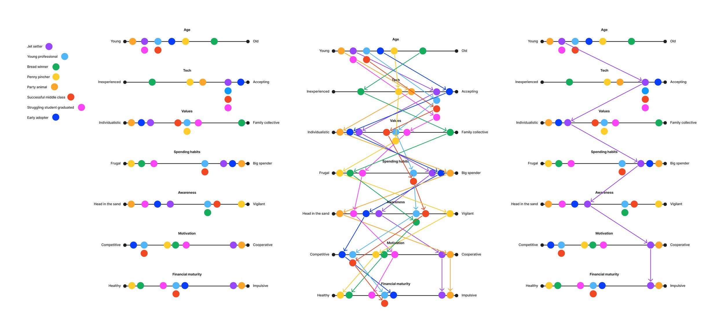
Eight personas was clearly too many. Many of their attributes overlapped. We therefore mapped out their attributes, interests and values into a chart of scales:
> Age
> Tech Confidence
> Family/Personal Values
> Spending Habits
> Awareness
> Motivations
> Financial stability
After the chart exercise, it was clear that the eight personas could be grouped into three segments:
> Jet Setter / Party Animal / Early Adopter
> Penny Pincher / Struggling Student or Grad
> Young Professional / Breadwinner / Successful Middle Class
The primary persona, who would benefit most from FinChair, was the ‘Jet Setter’. With the project being a two week sprint and time being short, we chose one persona to focus on.
It is worth noting that I encouraged the founder to explore the other two persona segments beyond the scope of my involvement.


Empathy Map
Knowing more about our user, we are now able to wear their shoes and look at things through their eyes. We can empathise with their feelings and we can record things from their perspective.
The empathy map will remain a good reference point throughout the design process. We can keep coming back to it to see what the user might say, do, feel or think about our design choices.
Problem Statement
Nearing the end of the ‘Define’ phase, we have narrowed down the Jet Setters problem, to a single statement that can summarise our challenge.
“A ‘jet setter’ needs a way to stretch, maximise and make the most of their finances so they will be able to maintain their ‘jet setter’ lifestyle.”
Hypothesis
“We believe that by providing an educational way to earn rewards, we will help young adults de-mystify their finances. We will know this to be true when we see money flowing from our commercial partners and into our customers wallets.”
Our hypothesis provides an entry point into the products design, for the ‘Develop’ phase of the process.
3/4 DEVELOP
Crazy 8’s
Crazy 8’s is a method for rapid idea generation. Not only does it help you come up with new design concepts, it helps you let go of your bias towards your existing ideas.
We included the founder in the workshop.
Storyboard
Now that we have a persona to focus on and have done some rapid idea generation with our ‘Crazy 8’s’, it was time to set a scene and come up with a story. This will help us define our ‘User Goal’ and ‘User Flow’ in the coming steps.
Our ‘Jet Setter’ is trying to find some money in his finances for flights for a weekend trip
He receives a notification. The notification states that he spent ‘x’ on his credit card last month. Had he been savvy, he would have noticed there were deals to save him ‘x’ that he didn’t take advantage of
He follows the notification and opens the app
He then sees a breakdown of spending and clicks the redeem button
Here, he chooses from a bunch of challenges that are aimed at educating on healthy financial habits
In this case, he had picked a video, which requires a short multiple choice test after, just to prove you were paying attention
He answered correctly and redeemed the money available. As well as increasing his credit rating (on the appropriate challenges)
He is at the airport, with flights paid for by FinChair

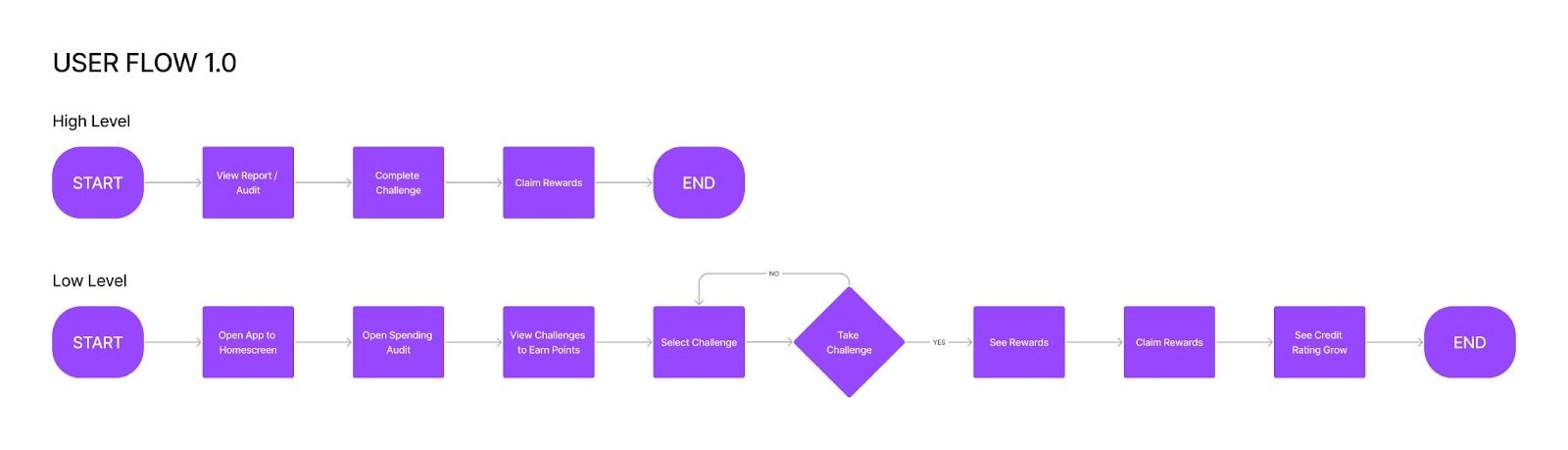
User Story and User Flow
The ‘User Goal’ is used to shape our ‘User Flow’ - otherwise considered as the process required on the app to achieve the goal. Once we have a high level understanding we can break down the flow into further smaller actions and decision points. We now have a good idea of what pages and decisions will be required in the app. We can now start designing our wireframe prototype for testing.
“Review your spending and gain rewards by learning healthy financial habits.”
Prototype
The idea of the prototype is to quickly design something that can be tested. It is supposed to be basic, and void of colour to prevent and colour bias that might exist within our testers. The less information the better, so we can understand where information may be required to improve the User Experience.
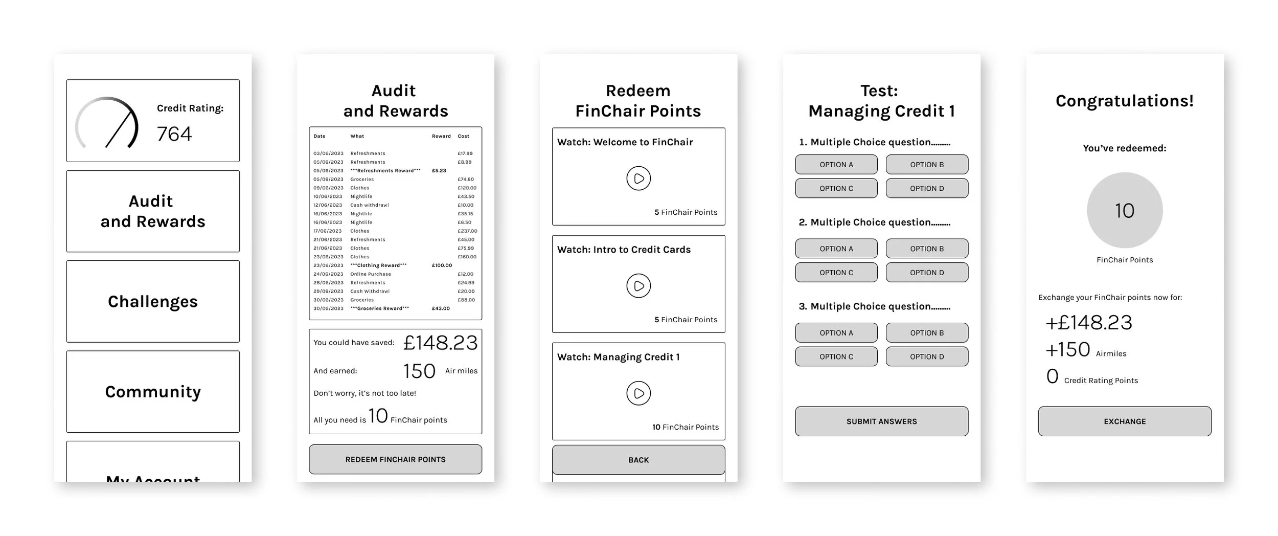
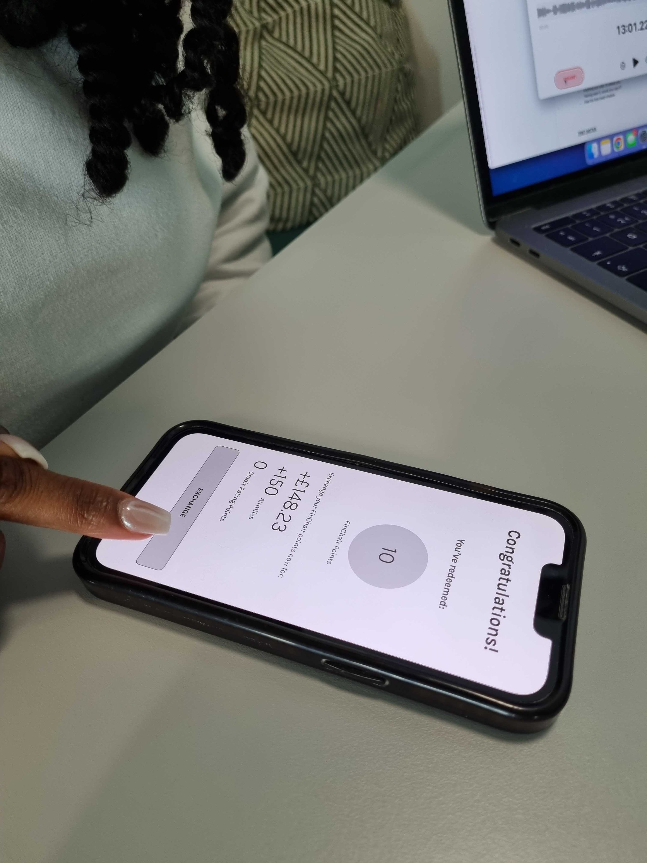
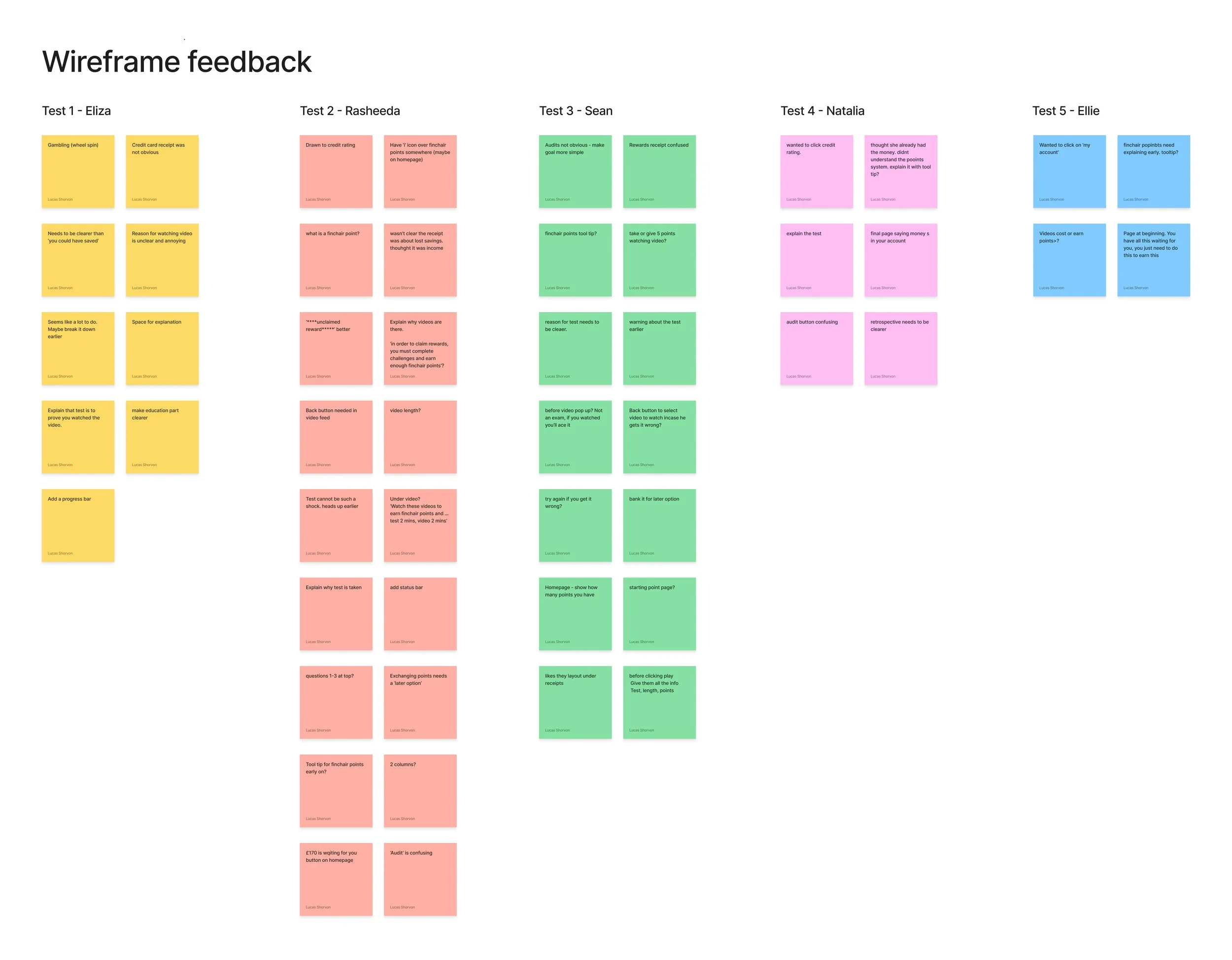
Prototype Testing
Armed with a clickable demo, I tested with 5 people who fit the persona mould. After 5 tests, it is said that you have uncovered 80% of insights and any testing beyond that will likely just bring up the same points.
The main goal was to find parallels between the experiences of our users while testing. We want them to complete the user goal: “Review your spending and gain rewards by learning healthy financial habits.” with as few hints and leading questions as possible. We want them to think out loud and explain their process. We want them to give us feedback to shape the next steps.
User Testing Feedback
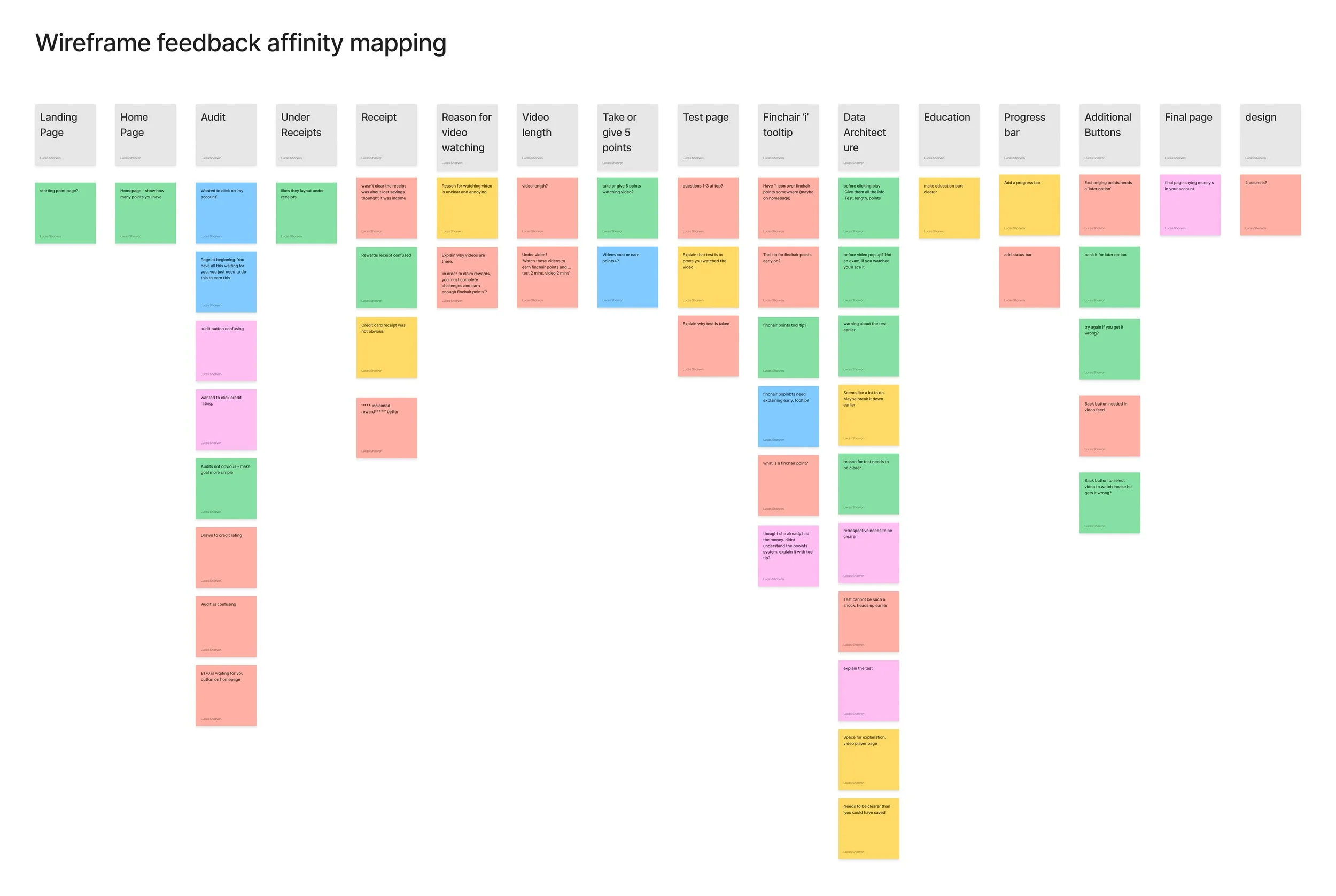
With 50+ individual insights gained from the 5 testing sessions another ‘Affinity Mapping’ exercise was needed to highlight commonalities and themes that will help improve the designs going forward.
The recurring insights included:
> Then navigation needed to be better. Especially a back button
> The process needed to be clearer from the beginning. The user didn’t know that they were embarking on a video and test journey
> The feature hierarchy on the homepage made things confusing. More thought was required
> A tool tip could be useful across the app
User Flow 2.0
Some of the feedback from user testing centered on the flow itself. There was a need to add in more pages and decision points.
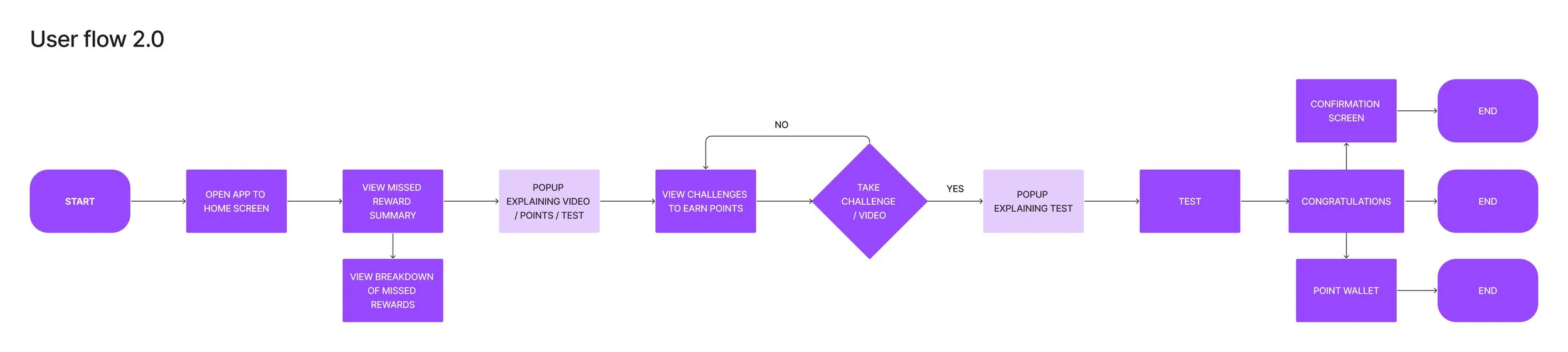
Information Architecture

The rest of the feedback centered around information and how to display it. For that reason, I undertook an information architecture exercise.
Once I had my new user flow, I was able to start thinking about the information required on each step of the flow. Much of the information architecture came from my user testing feedback.
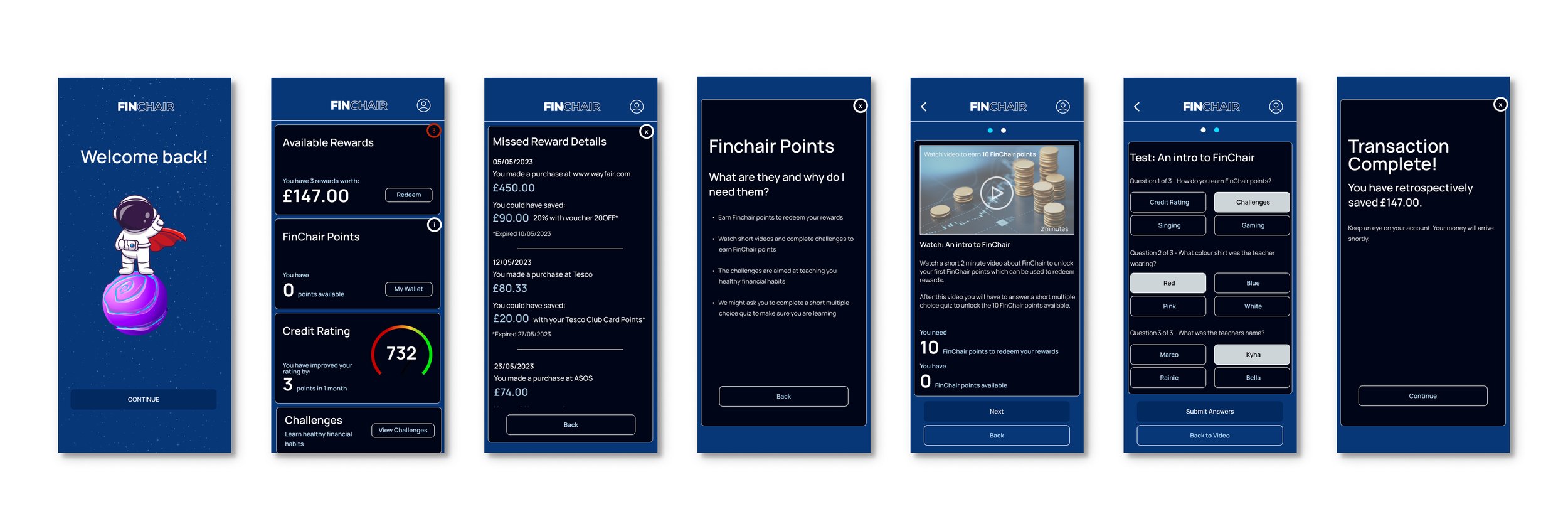
High Fidelity Design
At this point, I had enough data, and a solid framework based on feedback, to design with more confidence. Meaning, I was able to design a high fidelity solution. Of course there is always room to reiterate and test a wireframe, however due to the aforementioned time constraints , it was time to move on and design the UI ready for the stakeholder presentation.
4/4 DELIVER
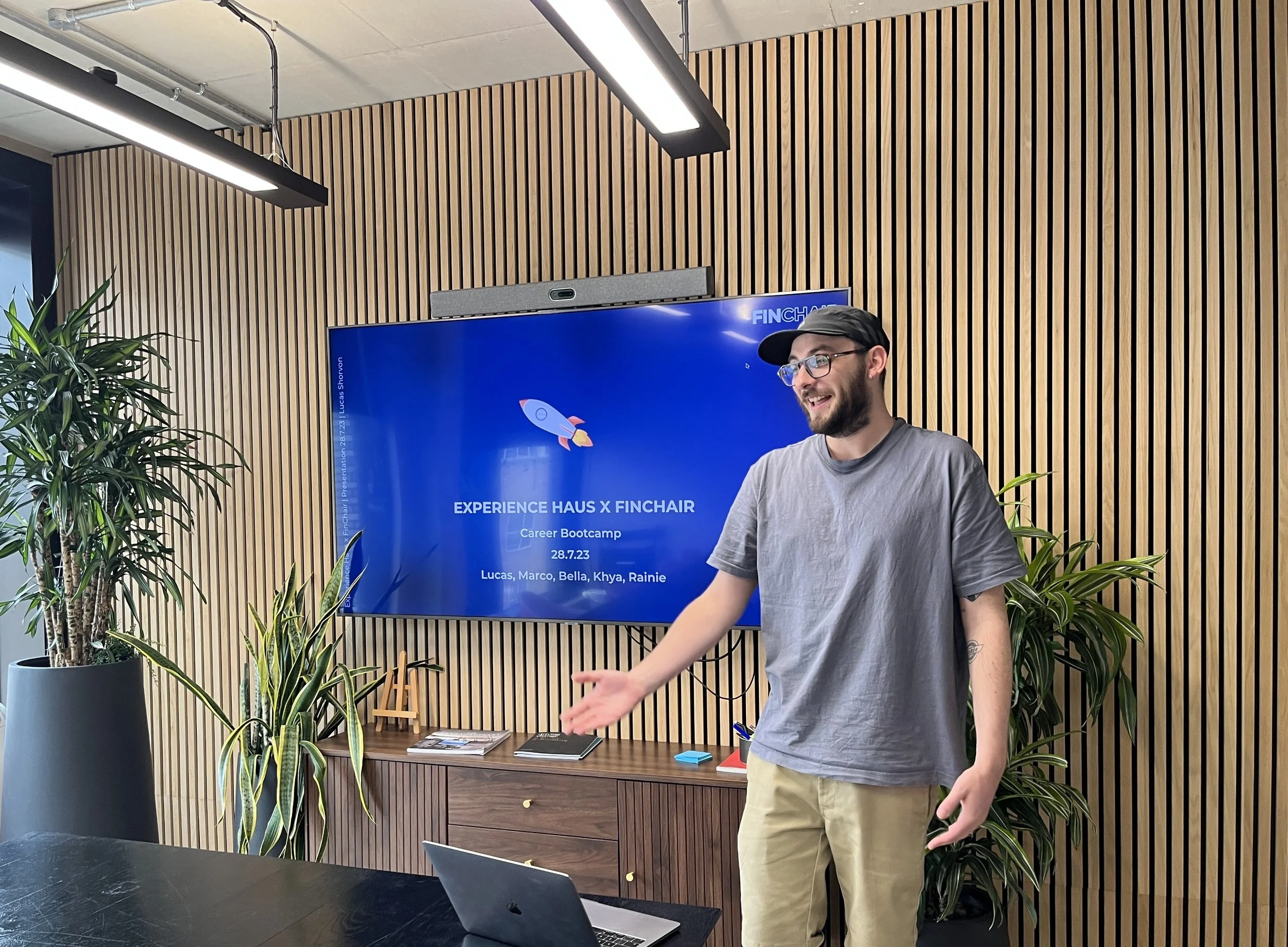
Presentation
Finally, I got to present 2 weeks of hard work to the client. The pitch went well and he particularly liked the education piece and saw how the challenges could be used to teach the users healthy financial habits. Whatsmore is the rewards were valuable enough for users to maintain engagement with the app.
Next Steps
Things will never be ‘finished’. There is always room to improve. The next steps I would suggest the client undertake are:
> Test, redesign, repeat.
> Start thinking about the challenges and/or video content. Test assumptions about this with users
> Look at the capabilities of the APIs to plan how integrated the challenges can be
> Start integrating the credit rating feature into the education piece
> User flows for the remaining personas
> Accessibility testing
Reflection
It’s always a good idea to reflect on a project when it comes to an end. I thought it would be most productive to look at the pain points noted in the ‘Discover’ phase.
Pain points:
> Don’t understand how credit ratings work
The incentivised challenges could easily be aimed at educating, and guiding, users on healthy credit habits. Through integration to banking APIs, it could be very productive for managing your credit rating.
> Hard to control budgets in expensive, social cities
There are a lot of missed opportunities for savings in busy cities too. If we can help the user take control of their rewards, and educate them on healthy financial habits, they will live more comfortably in social cities.
> Find it hard to manage all the different reward schemes
The concept to retrospectively have the opportunity to save money, having missed out on deals, means that FinChairs users don’t have to worry about un-centralised reward schemes.
> Not always aware when they could be saving money
By centralising reward schemes, the user will be alerted to missed opportunities and the value. As well as an educational and gamified way to retrospectively save money they were unaware they could.